Williams Just Delivered the Perfect Modern F1 Rebrand
By
Nic Green
on
November 3, 2025

Williams have drawn inspiration from the past, whilst modernising for the future. Credit: Williams F1 Team
In an era where companies are looking to modernise their logos, so many are going down the route of simplification to the point where all character and soul is removed.
Take Juventus, for example. The Italian football club rebranded in 2017, replacing their iconic oval crest, which had been on their kits in various iterations between 1921 to 1982 and then again from 1989, to a styled monogram of the J. Not only is it horrendously ugly, but it feels corporate. Bland. Lifeless.
Perhaps the worst offender of all is Jaguar. Although their badge has taken many forms since the first winged badge in 1922, the leaping Puma has carried the brand (albeit in various iterations) since 1982. But shit hit the fan in 2024, when they introduced a new Jaguar wordmark as their new logo. It was introduced along with the ridiculous Type 00 concept car and a bizarre promotional video starring 2024's trademark diversity crowd.
The rebrand didn't go down well, with multiple comments on the ad posted to YouTube saying Jaguar had destroyed its 100 year legacy in 30 seconds. Another read "This isn't an ad, it's Jaguar's funeral."
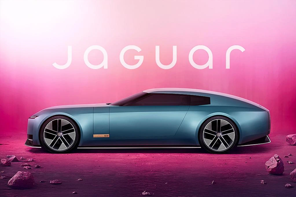
Jaguar's disastrous rebrand is ugly, bland and woke. Credit: Carsales
Thankfully, whoever heads up the marketing department at Williams has their head screwed on properly, because they may just have revealed the best rebrand in the modern era.
Williams' logo from 2014 wasn't offensive, but it didn't spark joy either. The blue Williams wordmark stood in a plain, clean font, with the capitalised W split into 3 pieces. Its corporate unoriginality coincided with a period in Williams' history that saw them slump into their lowest form, becoming a dull backmarker and having by far the worst car on the grid for more than one season.
In 2026, Williams will be looking to revive their form of the 1980's and 90's and their rebrand pays tribute to the logos that ran during that title-winning period.
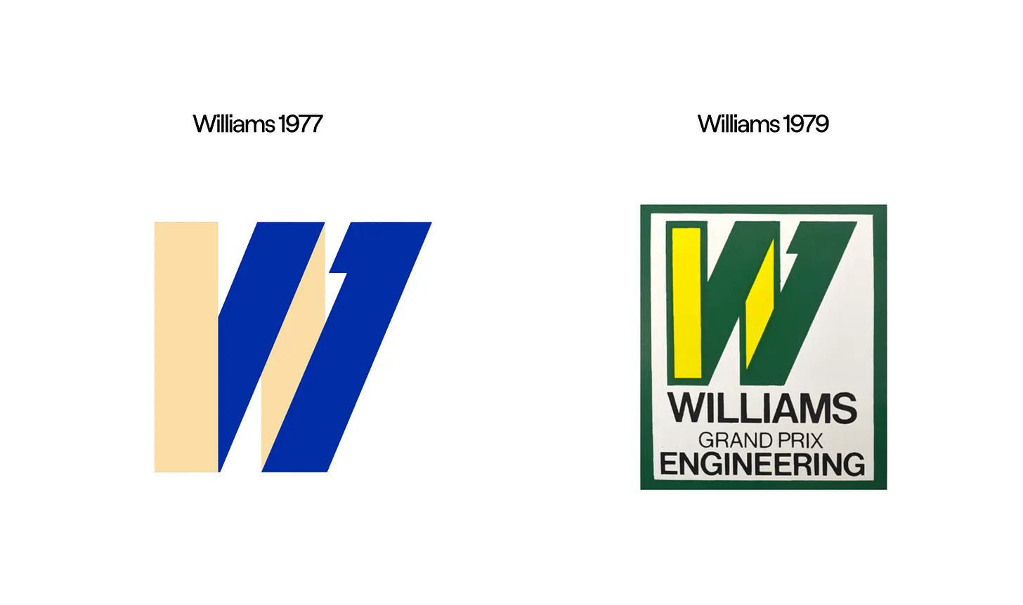
The first two Williams F1 logos feature the iconic slanted 'W' set to reappear from 2026. Credit: Oh Rouge
The new logo displays the Williams wordmark in slightly retro, thick font, similar to the one used from 1985 to 1999, with the capital W slanting slightly forward. The W also features a short, horizontal, inwards-facing stem, paying tribute to founder Sir Frank Williams and the iconic W logo used when he introduced the team as Williams Grand Prix Engineering in 1977. On a less significant note, the team name will now be Atlassian Williams F1 Team, rather than Atlassian Williams Racing.
The team at Williams have struck the perfect balance between retro tributes and looking to the future, keeping all the best elements of their truly iconic eras, whilst still keeping the design fresh and modern. It's a 10 out of 10 effort. Perfect. They'll now be hoping that the 2026 car continues on this trajectory.
.webp)



0 Comments